Examples

Visual-asset design examples

Eight AppKit Studio design-pattern demonstrations. These are clearly labelled in-house illustrations, not customer work, user testimonials, or claims about a published app.

MQTT Client app icon provided by the app owner
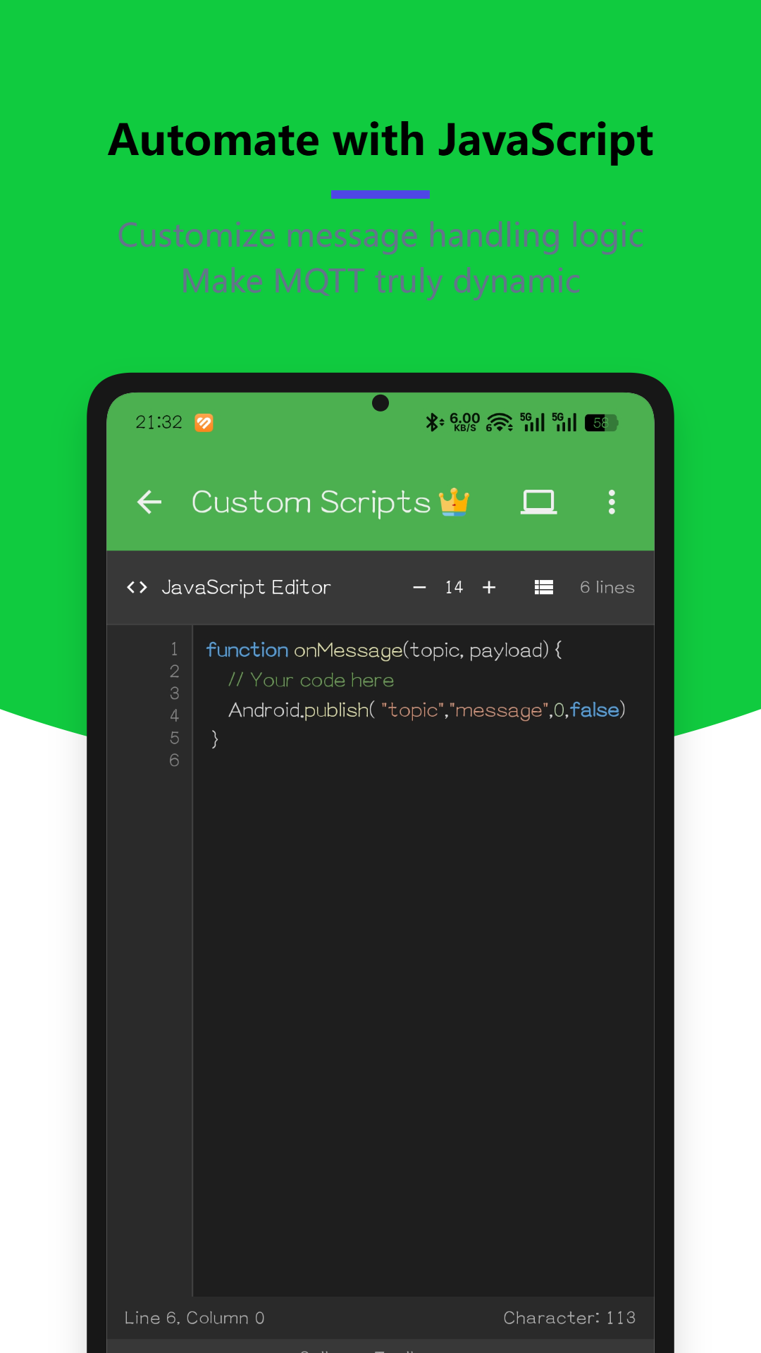
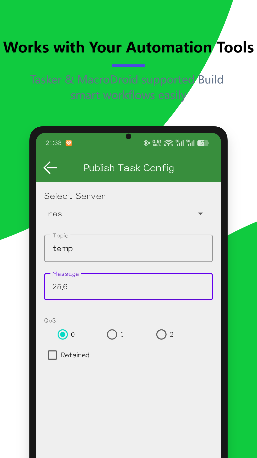
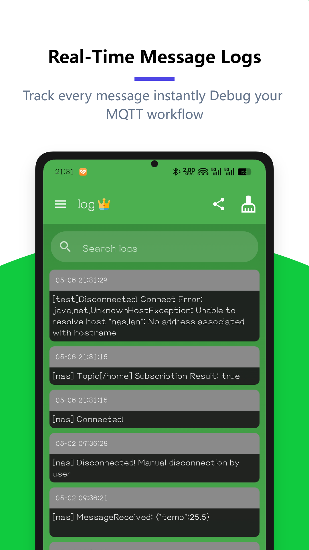
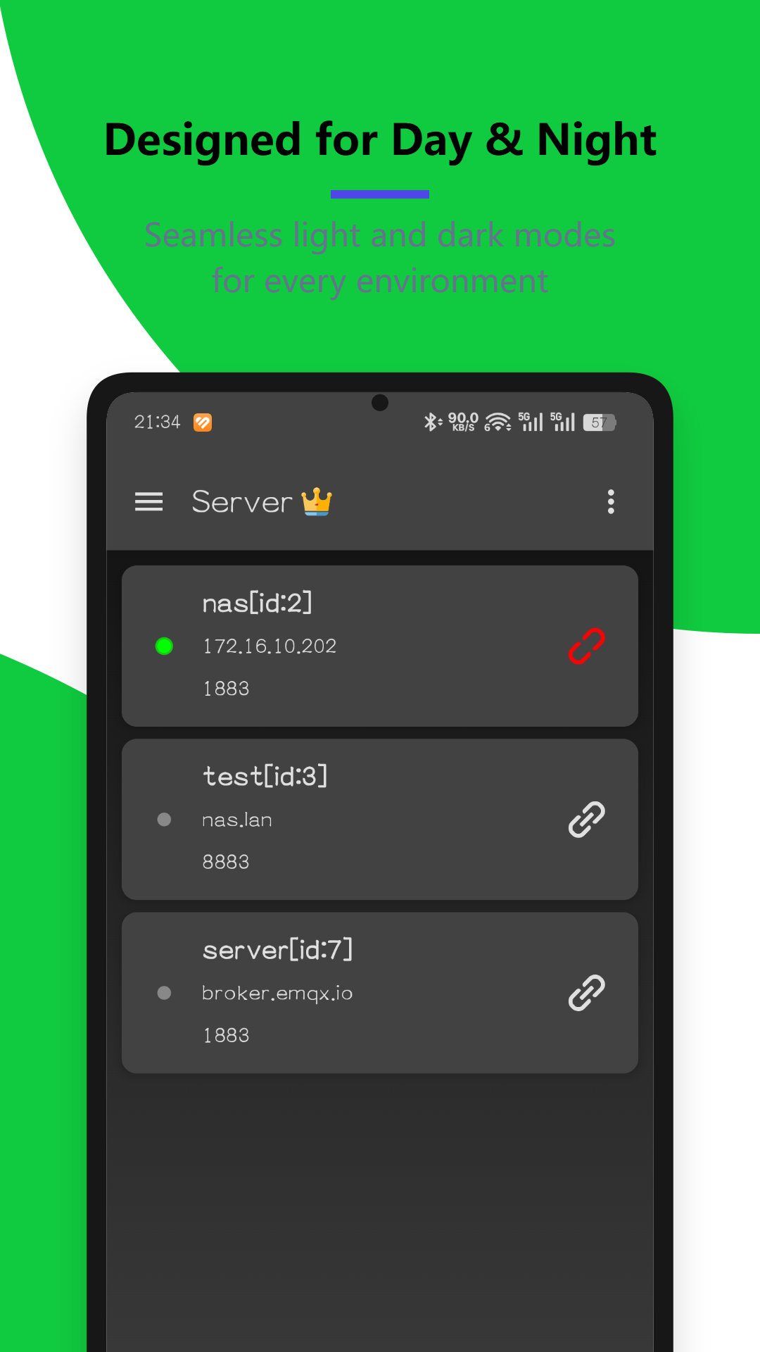
Real app example · Owner supplied

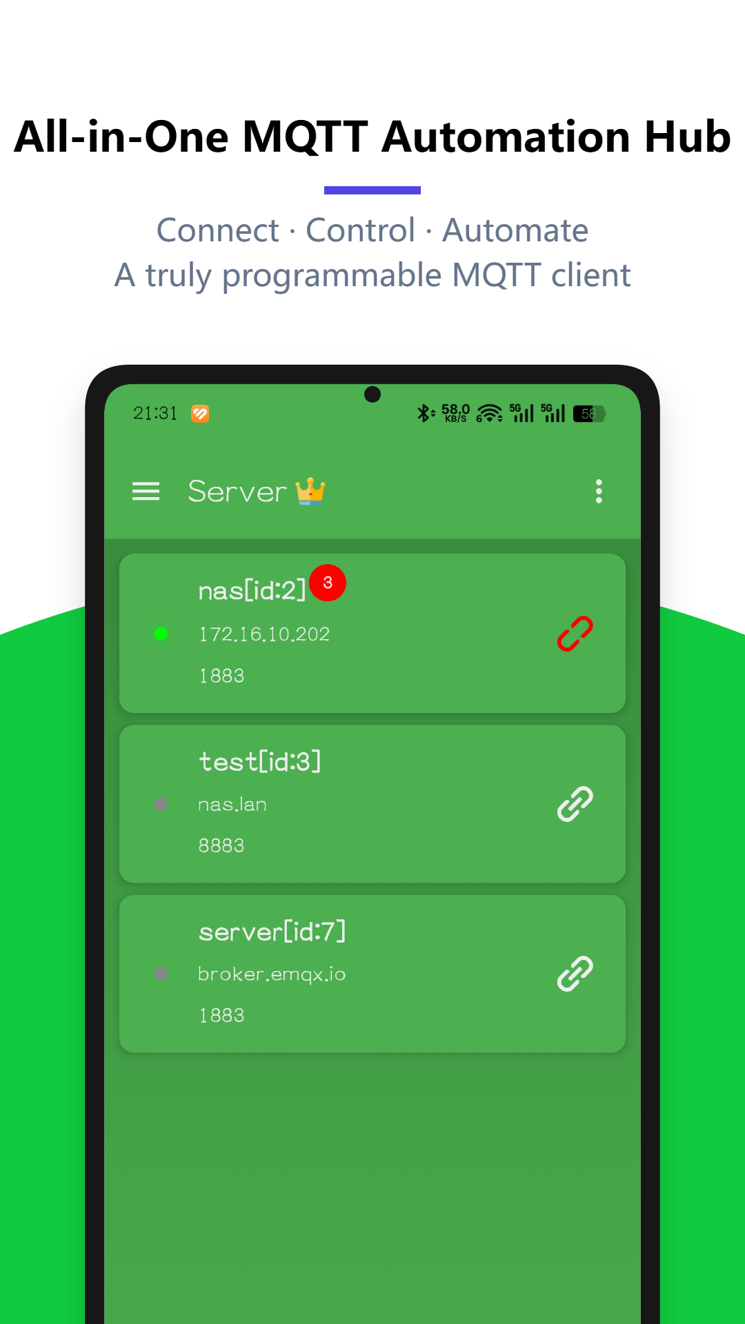
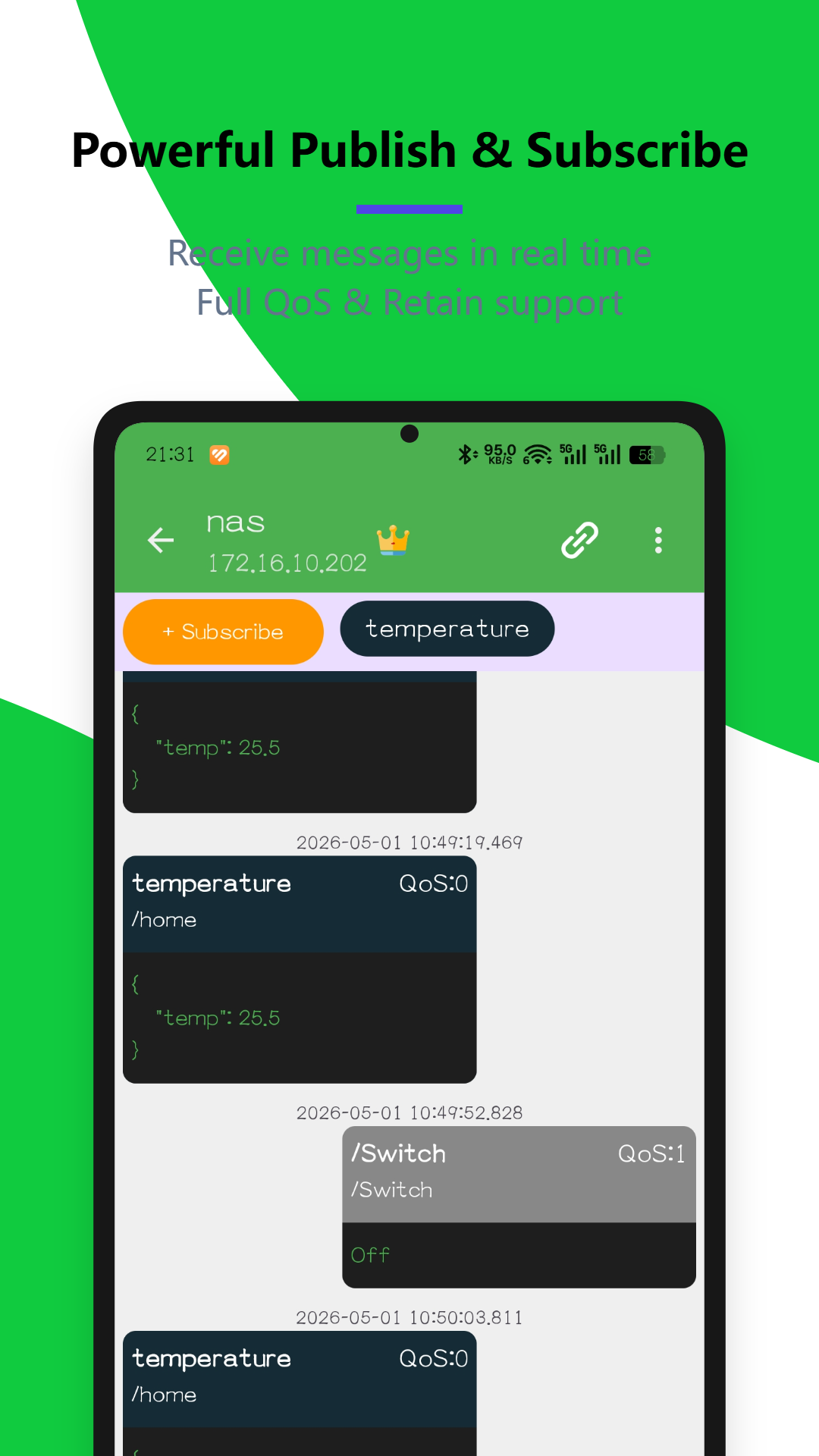
MQTT Client - Tasker & IoT&JS

A published Android app by Star Studio for MQTT automation, JavaScript processing, Tasker, MacroDroid, and IoT workflows.
View on Google Play ↗

Source and ownership: the app owner authorised this listing as an AppKit Studio example. Screenshots and icon are locally hosted copies of the current Google Play listing assets. They demonstrate a real store-listing sequence rather than a fabricated testimonial.
Design patterns

Additional educational examples

These illustrations explain composition principles and remain clearly separated from the real app example above.

App icon

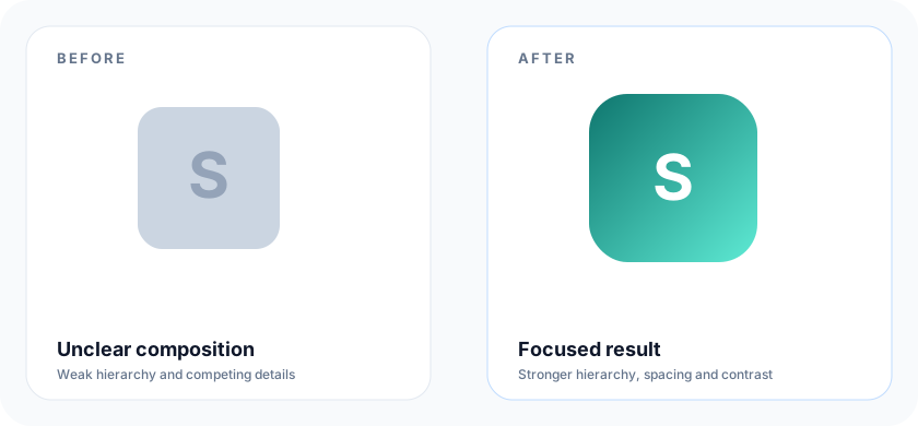
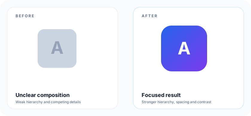
Clear focal-point icon

Clear focal-point icon: before and after AppKit Studio educational example
Before: Low contrast and edge-heavy source composition · After: Centred symbol, stronger contrast, and safer padding
  • Uses a simple primary shape that remains recognisable at small size.
  • Keeps the key symbol away from the outer edge.
  • Demonstration artwork created for AppKit Studio; not a customer case.
App icon

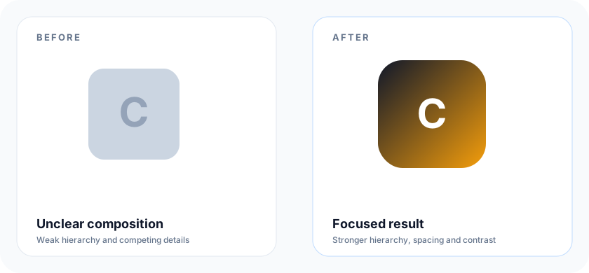
Contrast-first icon treatment

Contrast-first icon treatment: before and after AppKit Studio educational example
Before: Muted subject against a competing background · After: High contrast between foreground and background
  • Shows why a readable silhouette matters more than small decorative detail.
  • Designed as a generic tool demonstration, not a published app asset.
App icon

Balanced icon spacing

Balanced icon spacing: before and after AppKit Studio educational example
Before: Subject appears cramped at launcher size · After: Deliberate padding around the main mark
  • A visual example of safer internal spacing.
  • The final store icon should still be checked in Play Console.
Screenshot

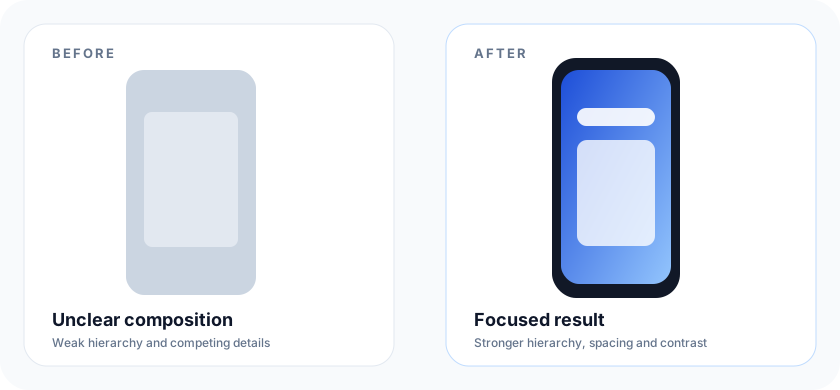
Outcome-first screenshot story

Outcome-first screenshot story: before and after AppKit Studio educational example
Before: A single UI capture without context · After: Short benefit line with a visible app screen
  • Demonstrates a short headline and an interface-first composition.
  • Created with AppKit Studio-style screenshot settings; not a customer case.
Screenshot

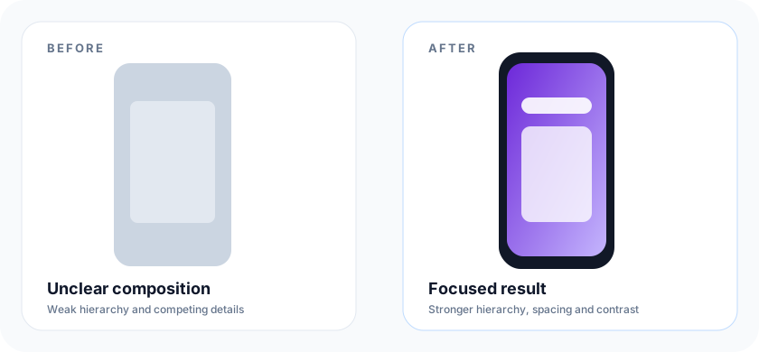
Consistent screenshot system

Consistent screenshot system: before and after AppKit Studio educational example
Before: Unrelated colors and typography across screens · After: Shared type scale, color, and device treatment
  • Shows a reusable visual system across a listing set.
  • Keep each frame independently understandable.
Screenshot

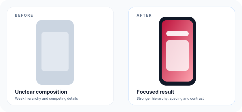
Legible screenshot hierarchy

Legible screenshot hierarchy: before and after AppKit Studio educational example
Before: Dense text obscures the interface · After: Brief copy and a clear UI focal point
  • Prioritises the actual in-app experience.
  • Text should support, not compete with, the screen capture.
Feature graphic

Focused feature graphic

Focused feature graphic: before and after AppKit Studio educational example
Before: Multiple competing messages and tiny details · After: One clear product message and central visual focus
  • Uses the 1024 × 500 composition supported by the Feature Graphic Generator.
  • Demonstration asset created for this site, not a customer case.
Feature graphic

Safer feature-graphic composition

Safer feature-graphic composition: before and after AppKit Studio educational example
Before: Important copy placed at the edge · After: Key content moved to a protected central area
  • Illustrates safer placement for key branding and copy.
  • Always review Google Play's current cutoff guidance before upload.